Cruising on the compass about three minutes away from Newtown Connecticut’s soaring flagpole, we swing up a country lane towards a stone wall. A picturesque scene of weathered structures sweeps upwards. The expansive grazing meadow meets clouds on a blue horizon line.
If Andrew Wyeth or Eric Sloane had ever imagined a pastoral scene, this 1758 Connecticut farmstead would be its archetypal image. Let’s not even peek into the main residence on this visit. We won’t survey the jaw-dropping paintings and prints by notable American artists of the second half of the last century who are in the artist’s circle of friends.
The art collection is installed like a relaxed museum of vintage English antiques and hand-lettered shop signage on porcelain. It’s a countrified “Antiques Roadshow” on steroids. If Mary Poppins were an interior decorator for a Connecticut inn, this would be her fantasy stage set.
Walking from the deceptively understated farmhouse residence into the nearby dairy barn, Robert Cottingham begins his daily routine. He glides through a massive barn door into the converted studio. A curtain wall of northern windows offers gloriously diffused ambient light. Sipping his cup of morning brew, he rolls up his sleeves and gets down to business. With a grim determination, repeating the morning ritual of decades of Yankee dairy farmers, Cottingham automatically gets to work.

Robert Cottingham
But rather than squirting foamy milk out of the teats of his heifers, he begins mixing oil paints onto a stretched linen canvas. As he squeezes paint from tubes onto a glass tabletop palette, the transformation into big paintings begins. He has produced enough buckets of art in almost half a century to earn him the reputation as a bona fide ‘American Master.’ Robustly active, he’s approaching a landmark 75th birthday this September (2010). In a remarkably productive career, he’s created a massive outpouring of work. But there’s more sweet ‘milk’ to come.

Robert Cottingham, 2010
Reviewing his last showing at Fifth Avenue’s blue-chip Forum Gallery, Art in America magazine notes: “Cottingham’s paintings present an untouchable and pristine universe… Like much hyper-realism, [it] verges on abstraction in its focus on details that seem to grow stranger the longer you look at them.” Artnews states “he remains at heart an allusive, lyrical realist.” And the Smithsonian’s American Art Journal summarizes his achievement as creating a “vocabulary of pictures and words that now define our times.”
The New York Times chimes in: “He does not slavishly copy photographs [but] clarifies and intensifies color, light, shadows, edges and reflections while giving the image a slightly softened, Vermeerish focus and satiny smooth finish.” Blink and curl that eyebrow. Did the Times’ normally parsimonious art critic just compare Cottingham in the same breath to the sublime 17th century Dutch master Jan Vermeer? You betcha!
Styles are the DNA of art movements. At their moments of conception, a cosmic birthing occurs out of individual creativity, societal zeitgeist and sometimes just a pinch of dumb luck. What was in Edouard Manet’s mind when he depicted a languorous picnic in a Parisian park? Did he realize in 1863 that Impressionism was just over the horizon? Just how those tiny strokes of a fluttering butterfly might eventually evolve into a global typhoon is the enigma art scholars are continuously re-constructing. Where and when did it all begin?

Roxy, 1972, oil on canvas, 78 x 78 inches
© Robert Cottingham, courtesy of Forum Gallery, New York
Try it this way. Music offers an easier way to track a stylistic trajectory. Replay those vintage vinyl 78s and 45s with Chuck Berry, Bo Diddley, Buddy Holly and Elvis synthesizing unpolished black R&B, jazz, and rockabilly into a new sound. Cleveland DJ Alan Freed first articulated its arrival as a newly minted “style,” naming it “Rock & Roll”— and a distinctively American new groove was blended.
By the early 1960s, four lads from Liverpool (enthralled with imported Sun Records and early Motown 45s) would be converting musical elements into their British version of “Twist & Shout.” From the Mississippi Delta to the ghettoes of Detroit, “Rock & Roll” traveled all over the map before emerging as its own full-blown style by that night, February 9, 1964, when the Beatles changed youth culture, appearing for the first time on the Ed Sullivan Show. The rest was history….
OK, relax. Not so comfortable understanding the prerequisite art lingo/jargon about historical styles? Admit it, back in college your pressing concerns were not studying test images in that big thick Art History text. Cramming those dictionary definitions of Cubism, BioMorphism, or Surrealism is a fading, tormented memory. So, let’s go right to the final exam.

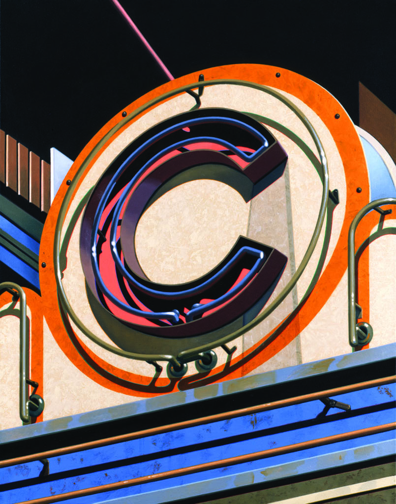
C (From An American Alphabet), 1995, oil on canvas, 42 x 32 inches.
Location: Community Theater, Fairfield, Connecticut
Q: Define “Photo Realism” and give examples of its origin as the signature artistic movement of its heyday. For bonus points, name three original Photo Realists.
A: It is quintessentially an American style of painterly hyper-visuality. It combines photographic exactitude with the precisionist rendering of forms enhanced and expanded through artistic choices and edits. It is an artistic landmark in the continually unfolding evolution of art styles notching up the ante in the tradition of realism.
Photo Realism’s subjects—wavy neon and stainless-steel retail signage, reflective plate glass windows and movie marquees, deadpan fragments of street level iconography, and an inherent tension between popular kitsch and vernacular monuments—both reflect and define the American scene just before it evaporated with the crumbling detritus of urban imagery past mid-century.
Sandwiched somewhere in between last vestiges of Pop in the late 1960s, but definitely ahead of Postmodernist deconstruction by the late ‘70s, the Photo Realists took their rightful place. Now go onto the multiple-choice section.
Navigating with our GPS on the map of 20th century styles, the movement’s genetic origins are traced back to the OK Harris Gallery in the SoHo district of Lower Manhattan. Along with Cottingham, its pioneering proponents are lifelong friends and co-workers Chuck Close, Ralph Goings and Richard Estes. Photo Realism was born in 1969 with Cottingham being very quickly featured among its first-wave proponents.

Star, 1985, oil on canvas, 32 x 32 inches, Private Collection
© Robert Cottingham, courtesy of Forum Gallery, New York
A slightly altered moniker, “Sharp-Focus Realism,” was staged by Sidney Janis for his trend-changing 1972 exhibit. Among its 28 key figures on the leading edge of the new movement, Cottingham’s star was fixed into the firmament. Nearly 40 years later, it’s still an identifying tattoo.
Eschewing the romantic, emotional or personalized realist traditions of Copley, Homer, Eakins, or Wyeth, the Photo Realists took a snapshot glimpse at the American scene with a detached objectivity that is always in competition with the sharp focus on the camera’s lens—but applied with paint!
Using a trustworthy Hasselblad camera (“my high-speed sketch book”) Cottingham’s photo-derived imagery exploded into iconic paintings. “Through that single reflex lens I was focusing on my visual field—and I am still referring back to those 2 ¼ x 2 ¼ inch square slides as an endlessly reliable source of reference.”
Decades later, Cottingham is still unfolding iterations of complex puzzles dating back to his classic period of the early 1970s. Unforgettably, he projected a fresh take of those dazzling, dizzying, déjà vu memories of our neon-lit daydreams in his tour-de-force romp down Main Street. Cryptic fragments of milestone images—F.W, ART, TIP TOP, STAR—are being reconfigured and blended into this hallucinatory Cuisinart blender of American signage. A choreographed arrangement of shapes cleverly form double-entendres as abstract fragments, textures and colors, while being a close-up view of sculptural details documenting a “once upon a time” of America’s urban streetscapes.
Monastic in his daily work habits but frenetic in his prolific output, Cottingham employs a creative process that is a multi-pronged art attack. Mind, heart and hands are synchronized like the perfectly tuned ‘super six’ cylinders of a ‘57 Chevy Corvette. A perpetual motion machine, he is ceaselessly on the offensive, churning out a torrential stream of preparatory graphite studies, larger gouache, or watercolor preliminary paintings, and finally full-tilt oil paintings.
Great art happens sometimes accidentally, but more often by an incalculable relationship of intentional decisions—leaving room for the magical, ineffable, and truly unexpected. Being true to himself as a creative force, there’s no wonder Cottingham is at the top of his game.

Ode, 1971, oil on canvas, 78 x 78 inches
© Robert Cottingham, courtesy of Forum Gallery, New York
VENÜ’s [V] Senior Arts Editor Philip Eliasoph follows along during a morning break for an informal conversation and studio tour:
V: In a recent museum catalog, you mention that we sometimes forget how to appreciate vintage signage, industrial components, typewriters, utilitarian objects, as “things in their own right.” How so?
RC: We define ourselves, individually and as a society, leaving evidence of these things to future generations. My work as an artist allows me to show with some fondness—even love—how deeply I felt in my emotional sense about these peculiar objects. Yes, these objects performed basic functions. You know we often don’t really look carefully enough at the urban landscape or the details of our visible reality.
V: And your artistic process empowers the viewer to better see?
RC: I think many of us have taken too much of our immediate environment for granted. Specific to our time and place—or at least an America that “came and went”—my imagery allows me to resonate in that imaginary intersection between the minds-eye and the retinal image.
[At this point, Cottingham gets up and moves to his work desk with a glistening white Mac computer: “What a joy: I was always searching for jazz on the radio. But now I’m streaming 24 hour jazz programs from Los Angeles, San Francisco and New York.” His face lights up with an elfen Irish smile and a hearty Brooklyn-born chuckle. Beneath a grainy 18th century wood beam of the hayloft, the state-of-the-art cyber communications hardware does not go unnoticed.]

m, 1996, oil on canvas, 78 x 78 inches, Collection of the Metropolitan Museum of Art, New York
© Robert Cottingham, courtesy of Forum Gallery, New York
V: Let’s take a stroll back to the beginning, when commercial art jumped the tracks over to fine art.
RC: My earliest memories were taking the subway from Brooklyn into Times Square with my dad, a salt of the earth guy with a perfect Irish working class union longshoreman pedigree. I must have been about 10 or 11 when I looked up at those pulsating billboards on Broadway. Do you remember the Camel cigarette sign with actual smoke pumped out in rings? It’s all still there in my mind’s eye—Manhattan just after WWII was better than any LIFE magazine photo shot could capture!
V: Take us from art school to finding your way and carving out a living as a studio artist.
RC: Even as a boy I was always interested in commercial advertising, especially the full-page “eye-stoppers” in popular magazines. I landed a position with Young & Rubicam in 1959 at their Madison Avenue headquarters.
V: That may as well have been the fictitious Sterling Cooper of today’s Mad Men TV series—was the creative advertising world that wildly cutthroat as you remember it?
RC: Well, let’s just say that there were very few loyalties at those three-martini lunches for the executives. But I was in the creative area, the art department, designing the ads, doing storyboards, collaborating with the writers and working with outside studios and free-lance people: photographers, illustrators, typesetters and film directors. I had access to the best creative talents in New York. I was also lucky to be in a group of art directors who made it a point to see the more important art exhibitions on our (extended) lunch hours.

Cafe, 1976, oil on canvas, 78 x 78 inches
© Robert Cottingham, courtesy of Forum Gallery, New York
V: So you’ve retained plenty of positive memories from those corporate ad agency days?
RC: Definitely! The Y&R I knew was an energetic, high-morale place to work, and a unique education. And most importantly, I met my future wife Jane, who was working with me in the art department and later became a copywriter. We’ve been married 43 years.
V: And there’s quite a large brood.
RC: Yes, we have three daughters, Reid, Molly and Kyle, and three granddaughters, Charlotte, Rowan and Maggie. I’m very fortunate to have all this family support for my work.
V: Gauguin left Paris for Tahiti, Jackson Pollock went from art school in Los Angeles to New York. What was your change in scenery?
RC: Y&R sent me to the Los Angeles office in 1964 and my vision was dramatically changed being out there. Those open boulevards, intense sunlight and clutter of entertainment billboards made a deep impression. I was also attracted to the sort of dilapidated aspect to those 1940s Hollywood Golden-era buildings. Everything looked like the seedy backdrops for a Bettie Page or Raymond Chandler B-movie.
V: What were some of your key influences?
RC: Of course, I always appreciated the special American qualities found in the paintings of Stuart Davis, Charles Demuth, and the photographs of Walker Evans. But it was seeing Edward Hopper’s “Early Sunday Morning” at the old Whitney when I was in my teens that really ignited me into thinking: “someday I’ll become a painter.”

F.W., 1978, oil on canvas, 78 x 78 inches, Collection of Museum Boijmans Van Beuningen, Rotterdam
© Robert Cottingham, courtesy of Forum Gallery, New York
V: How did Pop come to your attention?
RC: The spark happened to me at the landmark exhibit at the Sidney Janis Gallery, when the “New Realists”, better known as the Pop artists—Andy Warhol, Robert Indiana, James Rosenquist, Claes Oldenburg—were first exhibited together in late 1962. Up to that moment, Abstract Expressionism was really the only game in town. Now looking back, it was a crucial turning point.
[Editorial note: So outraged by the exhibit’s realist imagery, the “old guard” Abstract /Action painters actually bolted from Janis’ gallery. Mark Rothko, Adolph Gottlieb and Robert Mothewell all resigned in disgust.]
V: With that inspiration—drawing from the power of intensified realism—you began your own distinctive version of enlarged fragments of streamlined, Art Deco inspired buildings and signs. Those paintings have a sprawling horizontality, some with plunging perspective, others straight on like that creepy old house painted by Hopper but used by Hitchcock in Psycho.
RC: No question I was aware of those wonderful gas stations and angular perspectives by LA Pop artist Ed Ruscha. But at the same time, I became engaged in the development of a subject by rendering it in various mediums from different points of view. For example, many years later “Barrera-Rosas” would explore multiple layers of an architectonic and linguistic mosaic of light, shadow and forms which were revealed in an entire series of abstracted images: graphite, lithographs, gouache, watercolors and the final oil painting. I like working on many views in multiple media to keep it all cooking as an image is exploited to its maximum.

HOT, 1973, color lithograph, 21 x 20 3/4 inches (image), Collection of the Art Institute of Chicago, IL
© Robert Cottingham, courtesy of Forum Gallery, New York
V: Tell us when you felt your first big break happened.
RC: There’s no doubt that the OK Harris Gallery downtown was the happening place as Pop art was evolving towards Photo Realism. Jane, always my best critic and promoter, saw a man sweeping the pavement in front of the gallery one morning in 1971. She thought he might have been part of the maintenance crew, but it was in fact the legendary gallerist Ivan Karp. Jane showed him some images of my LA paintings and he quickly replied: “We’re going to make your boy famous.” I’m not sure I became “famous” — but a short time
later I joined OK Harris and eventually I was exhibited uptown in a major group survey of Photo Realists. It was an exciting time.
V: Your meticulous realism seems to have a truly abstract armature and undergirding.
RC: It does. The zig-zags, checkerboards, horizontal and vertical patterns on those funky old signs became a gigantic playing field of abstract, dynamic, sometimes even contrapuntal elements. Call it what you like. I’m constantly seeing more intricacies of those basic shapes and forms.
V: A career highlight was your 1973-74 “Road Trip Across America.” What happened out there?
RC: We were living in London at the time, but English signage just didn’t resonate for me. I felt a desire to get back to the States and applied for a National Endowment for the Arts grant. Winning the award was a big boost. It subsidized a cross-country excursion of lasting significance. Jane once called the trip my “photo-odyssey,” as I basically spread out a map, putting marks in the cities where the Greyhound bus routes were all linked. It was an exhilarating experience that ultimately produced an endless sourcebook of images. I photographed the downtown areas of 27 cities across the Northeast.

Ansco Shur Shot, oil on canvas, 32 x 32 inches,
recently purchased by the Connecticut Commission of Cuture & Tourism Gallery.
V: And how did you travel for the next road trips?
RC: I later rented cars and drove alone out west through roughneck tumbleweed cow towns, and the desert strip highways along the Texas-Mexican border. Many of the downtown buildings were about to undergo urban renewal. I felt fortunate to capture one final glimpse of urban America with those unique storefront designs from the 1930s-50s.
V: Reminds us of those bizarre scenes with Tommy Lee Jones chasing psychopathic Javier Barden in No Country for Old Men. Stunningly majestic for all its underlying garishness and artifice.
RC: Those stark, no-frills hotel rooms—I think a room cost about $6 to $8 a night—were part of my experience, and soon to be a part of the vanished American landscape. Yes, they do tend to show up in Coen Brothers or David Lynch films as backdrops.
V: How did you document that experience?
RC: I took over 2,000 Kodachrome slides with my 35mm Canon, which became a constant source of inspiration over many decades. It was like being in a reality version of Bogdanovich’s The Last Picture Show. I kept jumping on and off buses, catching the light against the facades as the sun was setting over my shoulder on endless Main Streets.
V: Let’s take a signature painting: How does a word evolve into an image like ROXY?
RC: People always assume ROXY is a movie theatre. It was actually a small bar that I found on a run-down commercial street in LA. It had the right scale—a small sign striving for a greater presence. I was attracted to the exotic mix of materials: neon, metal, concrete, mirrored surfaces and various lettering styles—pure Americana. With sunlight raking its surface, and smoked glass reflecting the buildings on the opposite side of the street, including a “Jumbo Burger,” this sign could have held its own in Times Square. I was challenged by its complexity—the rich layers of visual information.
V: This is genuinely fascinating, as you’re really taking the viewer deep into the matrix of your vision.
RC: Let’s break down the central issue: the word ROXY spelled out in flowing quadruple tubes of neon. What I see—what I can’t avoid seeing—is the layering of realities that visually inform us as to what we are seeing, and that will guide me in my translation of this phenomenon to canvas. Look at one section of the image—I am seeing 4 distinct layers of information. Interacting with each other we find: the neon tubes; the reflections of the neon tubes in the dark glass surface; the faint shadows of the tubes cast onto the dark glass surface; and finally, the intersections where the shadows and the reflections overlap. When I reassemble these elements on canvas, as with all my paintings, I find that the colors subtly become my colors, the forms—positive and negative—adjust minutely to my sense of form. The entire puzzle of ROXY is reassembled to become my painting, the image preserving the integrity of the subject, but as a new construction on canvas, reflecting my personal vision.

An American Alphabet, 1996, oil on canvas, 42 x 30 inches (each), Collection of Gunther Quandt-Haus, Bad Homburg, Germany
© Robert Cottingham, courtesy of Forum Gallery, New York
V: Your love for letters reached its apogee in “An American Alphabet.” This was really an ambitious three-year project, between 1994 and 96.
RC: Yes, and each letter was a detail of a subject I had already painted or photographed. My goal was to depict each letter in a style distinctly different from the other 25.
V: My iPad/iBook generation students have no clue what it meant to labor over a Remington typewriter to produce a 10-page term paper—footnotes, bibliography, and white out fluid all over our fingers! That relationship of manual labor, be it the secretarial pool in Mad Men offices of the ‘60s, or the college student in the ‘70s banging out an assignment on a primitive IBM Selectric or Smith Corona electric, is now part of history. These typewriters bring us to a renewed understanding of this not-too-distant past.
RC: The incredible beauty of those manufactured machines—typewriters with those ingeniously designed keys, rollers, and gears—should not be forgotten. I also did a series of cameras. My “Components” series of the past three years examines individual machine parts with 30-and 60-degree rotations and aerial points of view allowing each form to be viewed as minimalist sculpture. The closer I scrutinize the rounded edges and curves, the more I lean away from typical Photo Realist subjects.
V: You’ve truly gone full circle by now. With the “Components,” you are almost pushing the limits between hyper-realism and the ground-zero abstraction of Malevich or Donald Judd.
RC: The more I drill down into these shapes, the distinctions between the image and the abstracted forms tend to merge into a cohesive “thingness.” I can’t really say more beyond realizing that each object possesses its “essence.”
V: Bob, thanks for your generous time, and Godspeed. But what’s next?
RC: Wake up tomorrow, put on my pants, brew some coffee and get back into the studio. I’m still playing out some visual ideas I gathered out there on the road 35 or 40 years ago. And there are plenty of new ideas that are just now percolating, so I have enough work to do as the journey continues.


Leave a Reply